Superhero Billboards
I was lucky to be given the opportunity to design an ad campaign for Farmers National Bank. The client wanted multiple superhero themed billboards to celebrate both their branch managers and one of the brands main strengths; Stability.

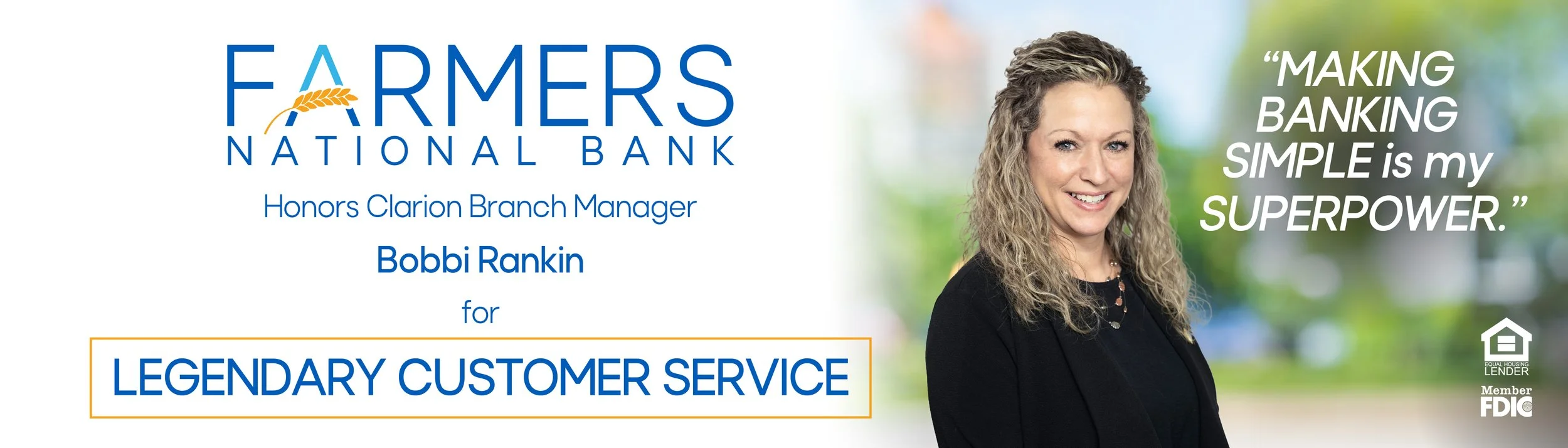
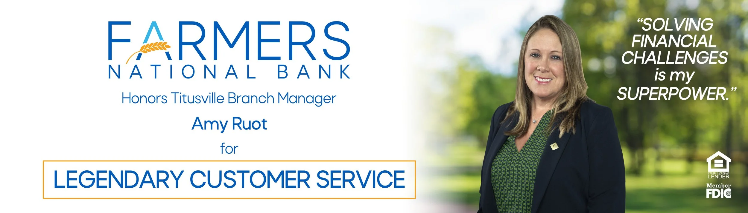
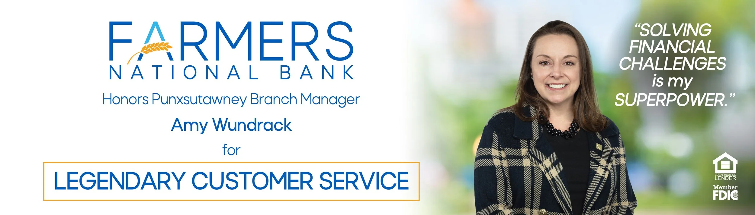
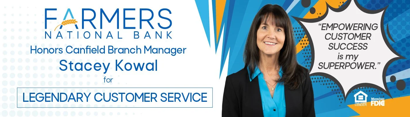
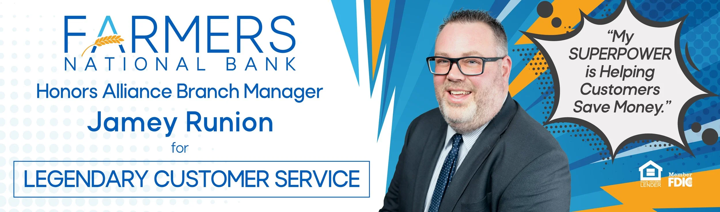
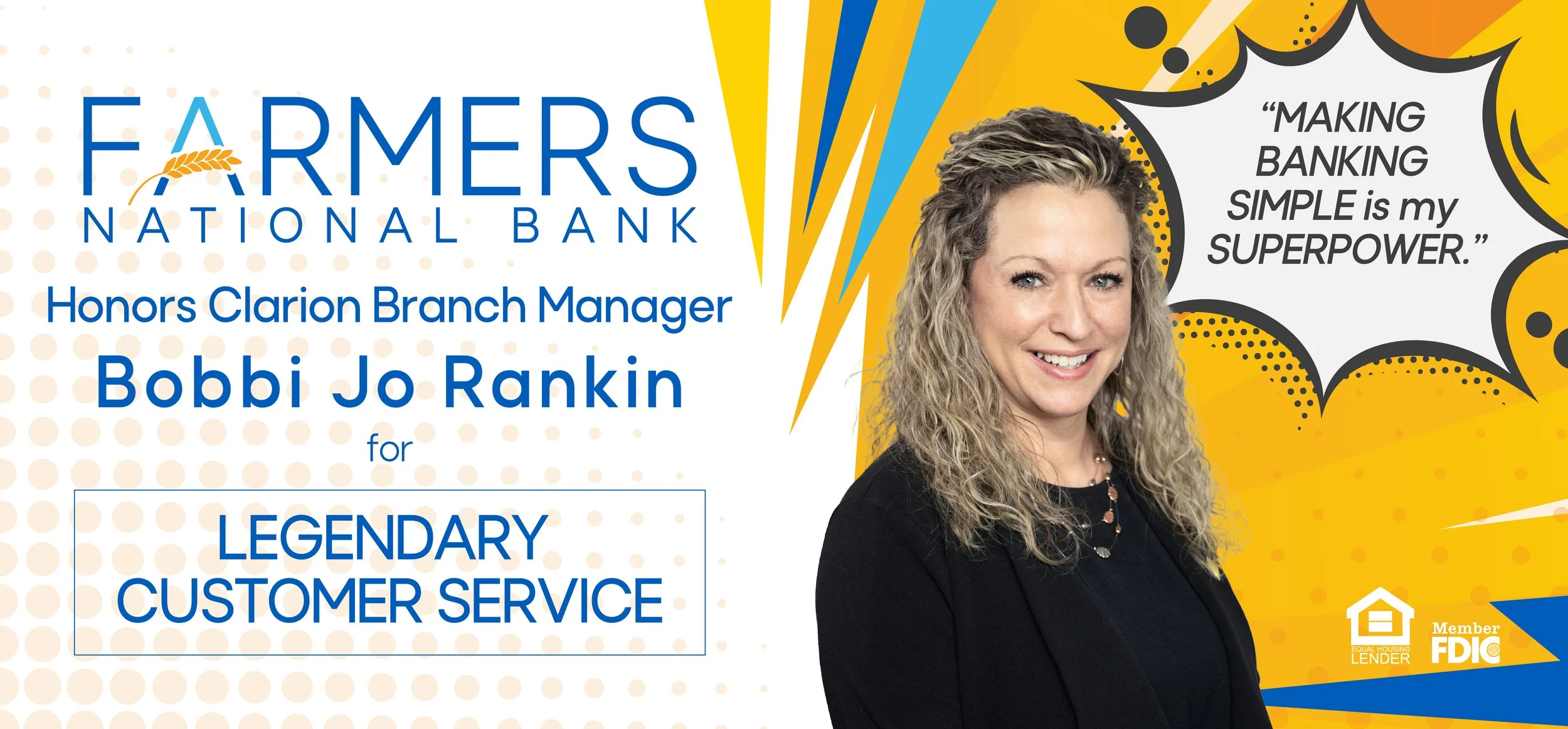
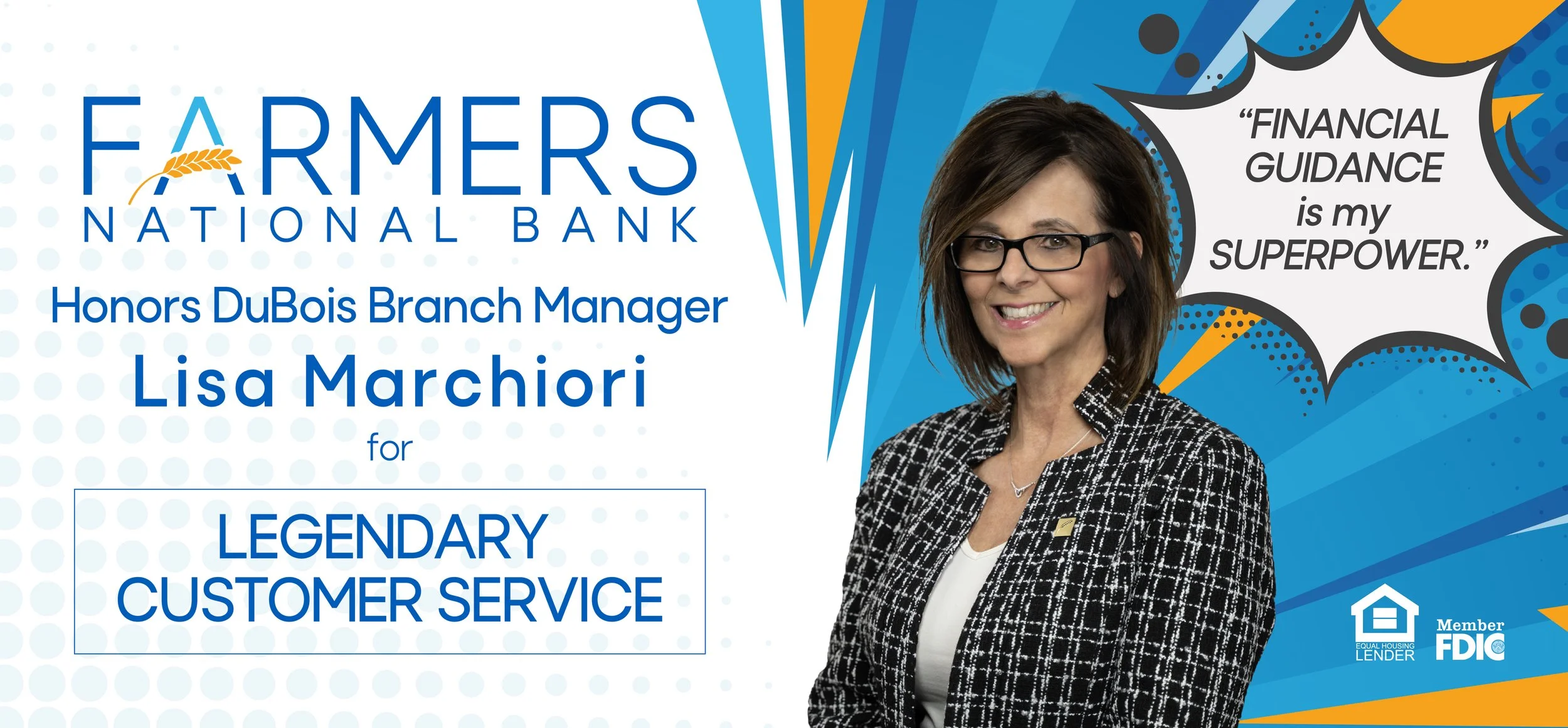
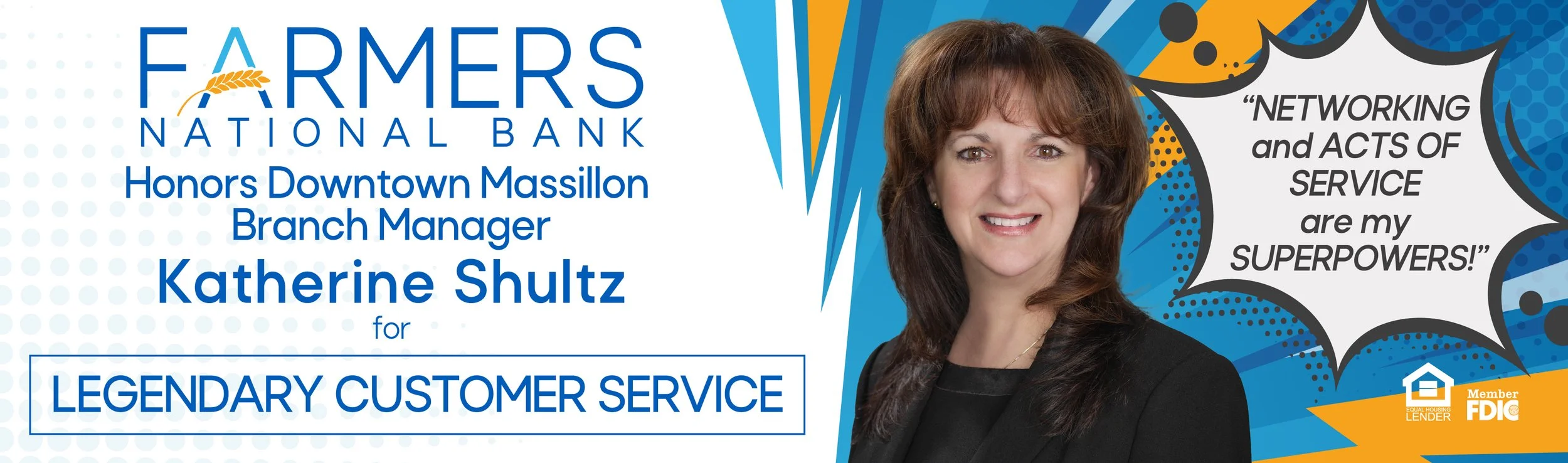
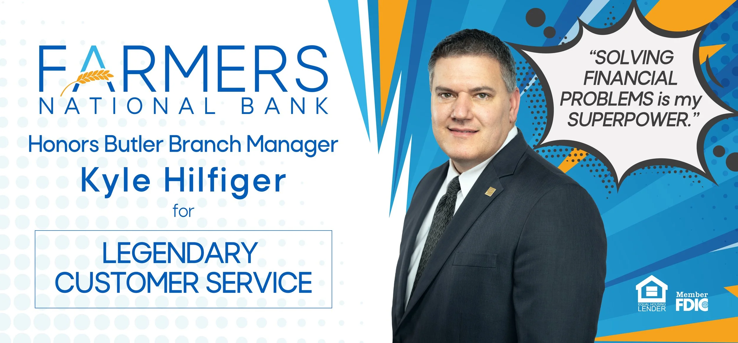
First, I was tasked with coming up with a general layout to organize the information. We had to have the Farmer’s logo, location, the name and photo of each branch manager, that they were being honored for legendary customer service, and a quote telling what their superpower was. We decided to have the photo and quote on the right side of the billboard with the rest of the information to the left. We also thought the most pertinent information was the Farmer’s logo, the name of the branch manager, and the words, “Legendary Customer Service.” The client especially wanted the logo and words, “Legendary Customer Service” to stand out, so we used hierarchy of scale to make the words larger than other text elements. We also highlighted “Legendary Customer Service” with the outline of a yellow box around the phrase.

After the first billboard ran, the client decided they wanted an ad campaign based around this original billboard. We got to work making a total of five more. I ended up learning how to touch up photographs on this project, and had to employ a variety of techniques to whiten smiles and smooth skin textures. I also had to replace the backgrounds on each photo, matching the lighting and colors of the branch manager photo to its new background. We also made the type on the right side of the billboard only white as to contrast with the background better.


Originally, the client loved the designs, but later decided they wanted to go in a different direction and lean more into the superhero theme. They also decided they wanted to add eleven more billboards to the project. We ended up searching for images we could use in the background, inspired by the comic book style and Roy Lichtenstein. We found a couple of exciting backgrounds that were in the Farmer’s blue and yellow, since we needed variety being that some areas would have more than one billboard. We designed one billboard with the comic book background taking up the entire billboard and one with the white gradient from the previous design on the left. We also added a text bubble to elevate the theme.


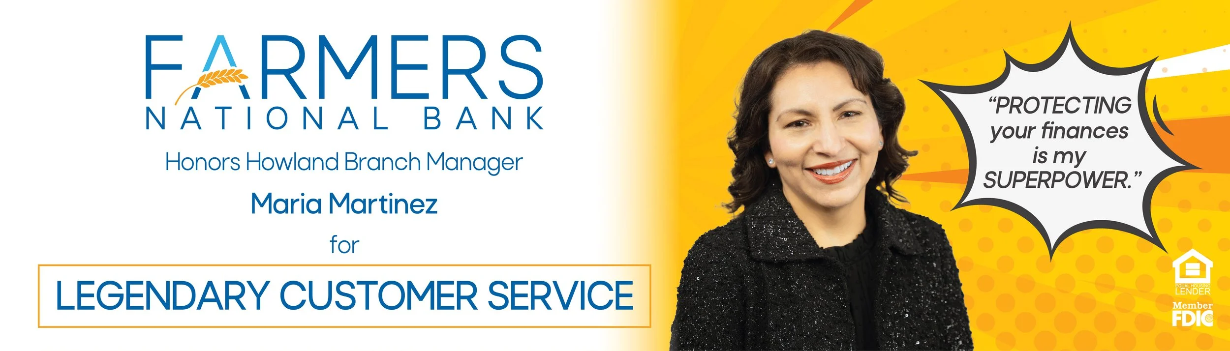
Though on a good track, something was missing. We decided to bring in some of the yellow into the blue background with yellow lightning bolts, and then blue into the yellow background with blue lightning bolts. We also felt like the white gradient wasn’t working as well, so we replaced it with cutouts, allowing the graphic lines of the background to be used to transition to the important information on the left side of the billboard. We also added a light halftone pattern to the left so it would feel more harmonious with the right side.


The client loved the designs with the half white half designed side, so we went ahead and made seventeen billboards total celebrating each branch manager and their superpowers that help them serve their clients.


The client also wanted one more billboard that celebrated Farmer’s National Bank’s stability. With the Farmer’s logo, tagline, “Stability is our Superpower”, and subheading, “Same name since 1887”, we got to work designing another billboard.
A photo of a caped businesswoman overlooking a town was chosen for us to work off of. They wanted her cape color changed and some element relating back to Farmers National Bank on the back. We chose the wheat, which can be found in the logo and has been used to represent the Farmers brand for years. I once again learned more editing skills in photoshop while changing the color of the cape, touching up the photo, and adding the wheat icon.
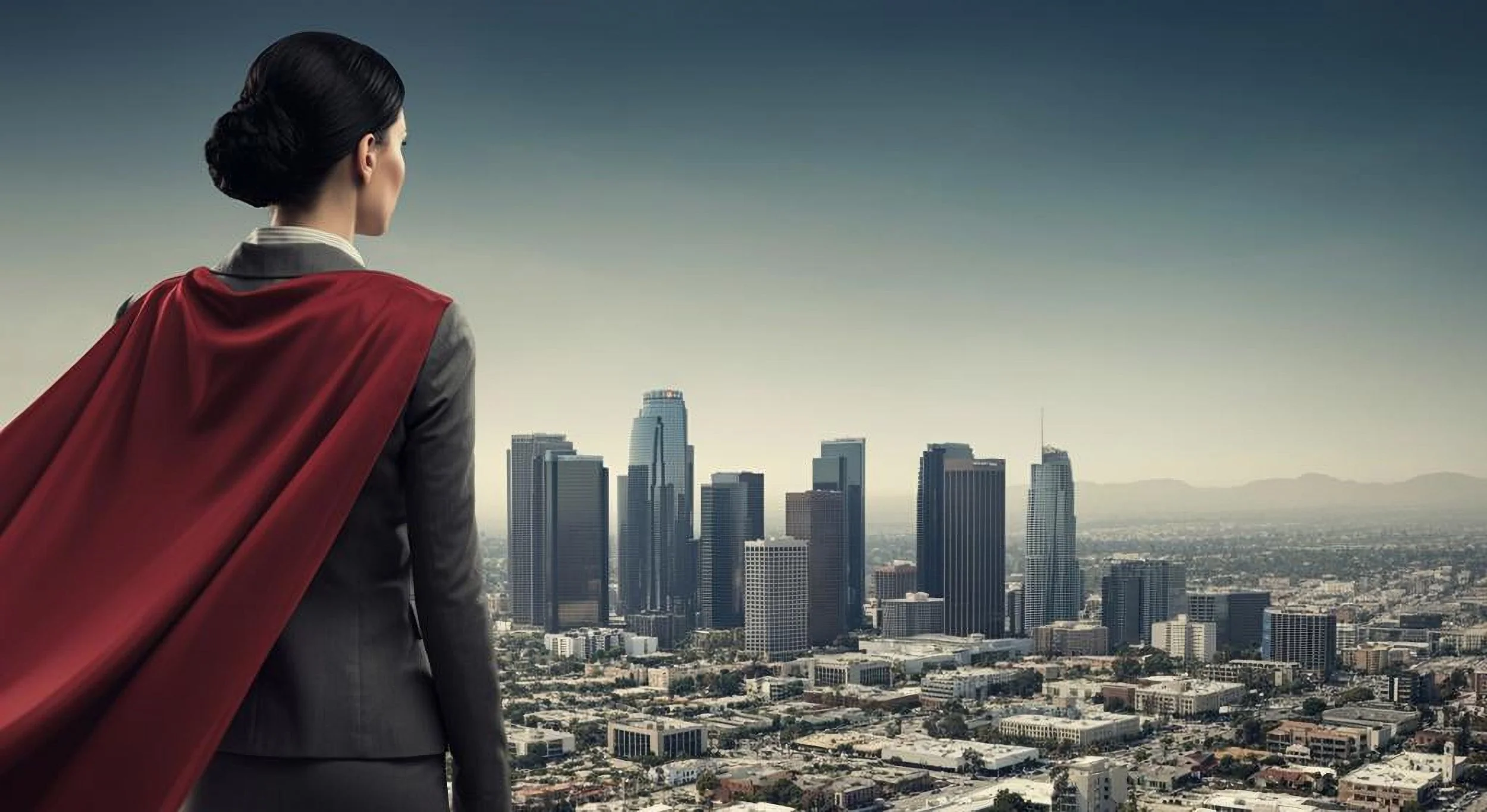
I researched some images of superhero typography and decided on a strong sans-serif font that I could add outlines and a pop of color behind, pairing it with Rota, one of Farmers approved fonts. Together they capture the essence of a superhero, strong, exciting, and fun. I also added a graphic underline under the word “Superpower”, both highlighting the word and adding a little bit of comic book flair to the design.
We put the photo and text over a plain sky background to give the feeling of a superhero high up in the sky watching over citizens, but also because it allowed for the photo and type to shine. The client did end up wanting to see the same design with the fun background from the branch managers designs, but ultimately decided against it for the reasons above.


After thickening the font of the “same name since 1887,” the billboards design was finalized. I was also tasked with converting the billboard designs into social media posts. I had actually been tasked with designing social media posts based off of the superhero theme celebrating other Farmers employees across different branches, which can be found in my social media posts section. Overall, I learned a lot about designing an ad campaign, editing photos in photoshop, expanding my skills in illustrator, and working with both clients and our team at prodigal to produce a product the client loves and we are proud to have made.
